Johnny Tran

Designer. Coder. Motion Artist.

Visual Design (UI) Emails Branding HTML CSS/SCSS Javascript Explainers Video Animated Logos
Scroller
Scroll

A little about myself

I'm an experienced digital creative (specialising in ). I've been doing it for years and it's what I do best. I understand not just the limitations, but the possibilities. I bridge the gap between design and development; a gap that is often overlooked, yet so critical to the execution of a project.

What I bring to the table

Branding Explainers Animated Logos

Evoking emotion through motion

In the past few years, I've been really getting into motion graphics. Some advantages motion can have over traditional/static imagery include:

  •   Being visually striking using minimal page real estate
  •   Allowing for the opportunity to tell a story
  •   Helping to lift the appeal of non-tangible products
Emails Branding HTML CSS

A multi-disciplinary approach

Here's an EDM I designed on a new visitor management system. This was originally briefed in as a huge chunk of copy (which would have been an absolute snoozefest to read).

The gist of the product was that it could register all workplace visitors in 20 seconds. In situations like this, adding animation can provide extra context which can really help simplify your product offering and help customers make faster decisions.

See the actual template
Visual Design (UI) HTML CSS/SCSS Javascript

A focus on implementation

Too often, designers don't get involved in development, and the final product just doesn't look quite right. I don't shy away from technically-challenging work and I'm well versed in CSS/SCSS.

See the comparison below before/after I worked on the UAC course search (in both design and development).See the UAC course search.

Research

I also participated as a note taker in one of the user focus groups where users were able to speak freely about their issues with the old application. Problems were noted (below) and workarounds were designed to help ease pain points.

Inaccurate search results page
inability to select more than one institution
Too many clicks (4) to get from home to course description
Too many text input fields
Inability to click on course campus location
No way to get from undergraduate to international or postgraduate course searches
Results

We noticed the week after implementing the new design that there was a sharp uptick in not only page views but interactivity. 7 days after implementation, we found:

  • 7.1% more users
  • 7.1% more sessions
  • 10% lower bounce rate
  • 4% longer session duration
'Sort-by' search query method added to increase search accuracy
Adding dynamic filter-clearing buttons
One central search text input
Ability to filter via multiple checkbox parameters
Campus locations added via Google Maps
Institution logos added to easily distinguish between courses
Visual hierarchy and overall layout/design updated
Compare the two
Click and drag the slider to see the difference between the old and new course search.
New Old
Emails Visual Design (UI) HTML CSS/SCSS

Managing EDMs and their effectiveness

Good email design will only help to improve your click rates; not your open rates. If your open rates are already suffering, good email design won't save you.

The most critical part of your email campaign is your recipient list. If you have a group of people who aren't really interested, it won't matter how stunning your email looks. Your campaign is going to be a dud.

What affects your open rate?
Are your recipients even interested?
Has your domain been flagged on any blacklists?
Is your Sender name/subject line engaging enough?
What affects your click rate?
Are your emails rendering correctly in popular clients?
Is your content too bloated or spam-sensitive?
Do you have a dedicated landed page?
Recipient list
Domain reputation
Sender name
Subject line
Pre-header text
Email design/content
Dedicated landing page
Case Study

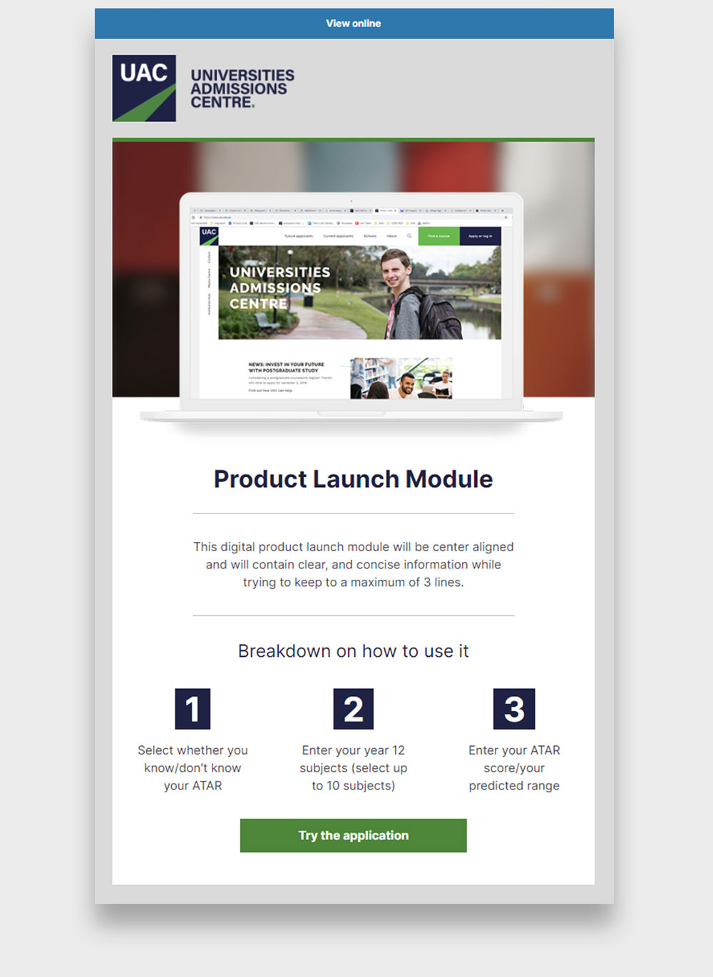
Take Figure 1 for example. Visually appealing, simple and coded to render on top email clients in mobile and desktop. How did it perform? Not so great. In fact, I think it only ended up with an open rate of 10% and click-rate of 1%; it wasn't even worth me taking note of.

Why am I telling you this? Because I think it's important to manage expectations. The truth of the matter is that email designs alone won't be enough to turn your campaign around. This email serves as a reminder that campaigns rely on every part of the process being done right — the list being the most crucial first step.

Figure 2 on the other hand knocked it out of the park whilst appearing incredibly basic (as per the requirement from the client). The results? 62.87% open rate. 35.85% click rate. The major difference? A good quality list of recipients likely to be interested in the content.

Another important thing to cover is a standardised design for all the possible types of comms (Figure 3). This means building out a branded email template for all sorts of applications. By going with a set template, you appear more consistent.

Interested?

So that we don't end up wasting each other's time, I've built a neat little single page app to measure how likely we are to 'vibe' (as all the young people say). Think of this as a pre-interview measure to see whether my ideals as an employee fit with your organisation's work culture.

{{index + 1}} {{ question.text }}

Thanks for taking the time to answer my quiz. Based off of the answers that you provided, I'm probably not the best candidate for your needs. Feel free to redo the quiz if you'd like to adjust your answers.

Thanks for taking the time to answer my quiz. Based on your answers, I think it'd be a swell idea to schedule a chat! Feel free to get in touch via any of the methods below.

Woohoo!

There's a pretty high chance we'll get along based on your answers. Please don't hesitate to get in touch via any of the methods below. I'll be eagerly awaiting your response.